Dark Knight Edition!
For a while now, I had been contemplating on a new layout. I was particularly intrigued by the new Batman movie, as you can probably see from the new banner and layout. I'd like to think this site plays a part in keeping the legacy of Sailor Moon alive just the same as Batman has been portrayed in so many different incarnations (and of course, there are even more fansites out there for him). Since this has been a big year (you could even say a blockbuster year) for many of the people involved with the series, I thought that the new layout should be a play on another big blockbuster. Like Batman rose from the ashes of two really bad films, the Sailor moon fandom continues to thrive all over the world despite the lack of releases. The Legend of the Moon Princess lives on!  Let's have a moment to remember the first layout. I don't think I ever posted my inspiration for how I wanted the site to look in the first place. I was a little fed up with most Sailor Moon sites being all pink and pastel and "girly". Yes, it is a girl's series, but there are a lot of fans who are guys, and I couldn't help but think they'd be a little embarrassed to visit these places in public or around their friends or other prying eyes. Besides, anyone who knows me knows how I loathe the color pink - I would never stand for my website being this color! It took me four months to get Moon Chase going, but the hardest part was trying to pick how I wanted the site to look. It could have all the content that I wanted, but at the end of the day, it had to look good. Eventually, it finally hit me after looking at my Sailor Moon dolls (still in package) that I should go with blues and yellows. Those colors were used a lot together in the series (especially in the skies) and if I did it right, they would be easier on the eyes. As for the logo, when I started the site, I was on a mission to bring whatever I could to the fans that couldn't be found very much elsewhere. I have a great staff and we work together as a team. The original logo was going to be a crescent moon, with stick figures of the staff drawn along the edge. But then I thought that would look a little crummy, so I went with a silhouette of the Inner Senshi ("Sailor Team") over the moon along with a calligrapher font. At the time, the fonts I had wanted to use didn't work... but I figured, it would do for now.
Time goes on, and as things get bigger and bigger, change is always there! I don't know how long I'll keep this one up for, but it will stay at least until the fall. Enjoy!
Sunday, July 27, 2008
Welcome to Moon Chase Version 2.0!
![]()
Subscribe to:
Post Comments (Atom)


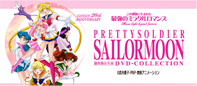 Toei's Official 20th Anniversary DVD Site
6 comments:
HAHAhaha!!! I see the Batmania is reaching even us, anime fans. I was intrigued with the movie as well (I drew a SM dressed as Batman) and I really enjoyed making SM not as girly as you mentioned). Its good to see SM in a darker more serious tone. I mean if she's going to save the world, it can't be pink and butterfly-ish all the time, right?? xDDD
Anyway, the layout looks great!! And I always always love checking out the updates.
Keep up the Good work!!!
Cycyn.
It looks good. I'm one of those fanboys who peer around the monitor to see if anyone might see me checking out those girly pink pages.
I love the new layout!! ^^
I was just watching an old episode of Late Night of Conan O'Brien and Seth Green was the guest. He was talking about Comic Con and how there are more pretty girls who go there. Then he said there are those girls who like the dress up as their favorite characters like Sailor Moon....
I can get the direct quote if you like to report this.
To all my readers: Thanks for your comments and I'm glad you all like the new layout! CyCyn I'd love to feature your picture in a future caption this! post. Senshi, send us an email with a summary of his appearance and the quote if you can - we'd love to report it!
You mean the Sailor Moon dressed as batman image?? XDDDDD
Yes! I'd love to see that picture!
Post a Comment